Design System - Tokens & Theming


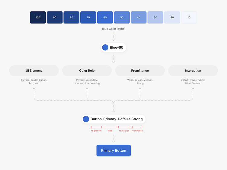
Сolor Tokens - are Variables that Hold a Semantic Meaning. Each color has its semantic meaning, which should be used depending on the design context.
To determine the design context, it is necessary to analyze the component into four basics: UI element, color role, prominence, and Interaction.
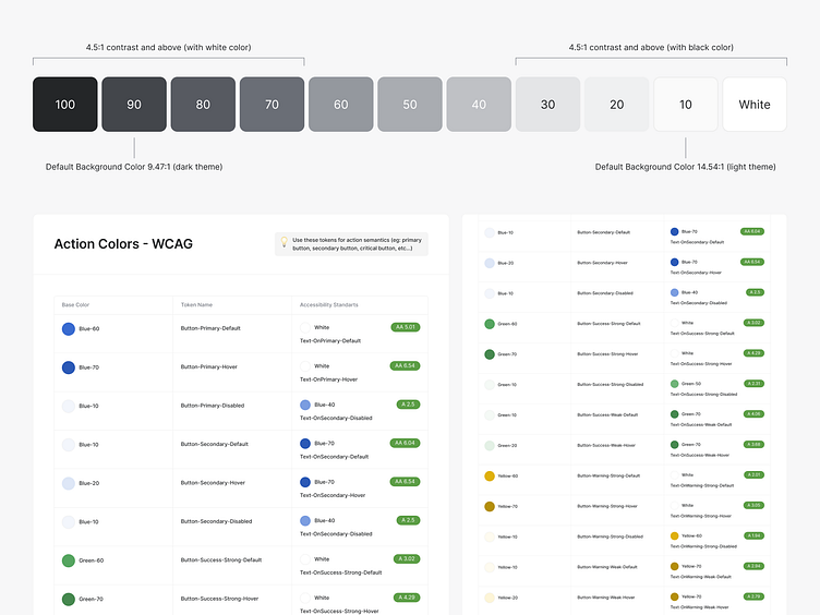
We always try to make design accessible to everyone and spend a lot of time on the availability of colors. To do this, we maintain a separate table with the relationship between color tokens and WCAG contrast standards.
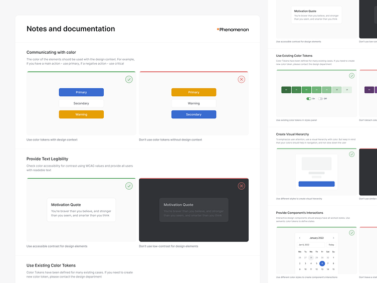
In addition to the detailed documentation of color palettes and color tokens, we will also spend a lot of time documenting color usage examples.
It helps to make the design more consistent and systematic, as well as set clear guidelines for the design and development team.
Using our approach of generating color palettes and color tokens, we can develop beautiful and accessible design themes.
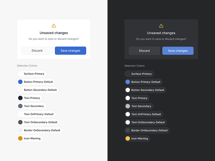
Also, with customized color tokens, we can clearly understand where which color to use, thereby maintaining consistent solutions in all themes.
We are happy to share one of our systematic design approaches! Color is an essential design component, which is why we spend a lot of time documenting and defining use cases, providing users with a beautiful and logical interface.
___
Visit our website to see more!
📮Want to say hi?
Drop us a few lines at hello@phenomenon-studio.com
Stay tuned with our updates at