Aetna Case Study
I wanted to use this new Case Study feature to showcase my illustration explorations I did for Aetna. The goal was to find an illustration style for their wellbeing app that never saw the light of day as this was in development when the CVS merger was happening. We used "Financial Security" as a frame of reference to build a number of styles and concepts from.
Working with an Art Director at Aetna, we started by framing Financial Security within the angle of financial freedom. These are the styles and concepts that were drawn out from this round.
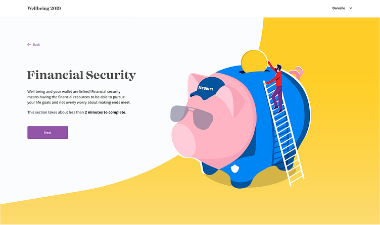
We then leaned into the security aspect of Financial Security.
In another round we explored building a nest to illustrate Financial Security. We took elements from all three rounds to find the style and angle that worked for Aetna.
From here we built out the illustrations for the rest of the wellbeing topics.


