Mosaic: An Experiment with Color
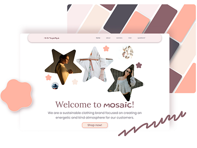
I decided to design something using my color palette for the Dribble challenge. I think the colors I choose give a feeling of warmth while still being energetic. Like a mix between being really cozy and having fun on a warm summer day. The design is for a company called mosaic who try to convey these emotions through their clothing line. They specialize in sustainable clothing for young adults, so I wanted the website to feel really fun, but also bright and airy. I had a lot of fun playing with the star and circle shapes! I also created kind of a logo mark using a font called redacted script. However, I also used a font called Gluten for the logo type so that it could still be read. I thought that the redacted script font would be interesting to play with for the company's clothing tags. It seems playful and energetic as well. Overall, I'm pretty happy with my design and color choices! Let me know what you think!

