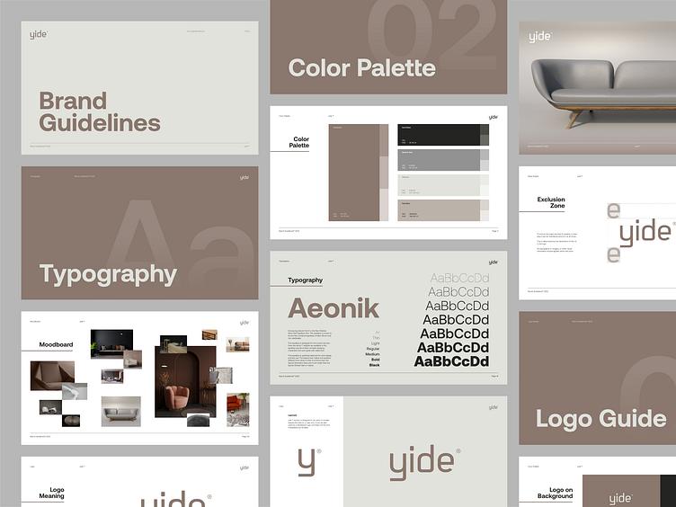
yide® Brand Guidelines
This document communicates the Brand Guidelines of yide ®.
Who - Yide is a modern furniture store. We specialize in making your home a joy and delivering quality materials.
Why - We believe peace and joy in your home is the best thing ever and seek to deliver that to our customers.
Voice - Clear, gentle, playful and promising
Feel - Clean, modern and trustworthy.
X-Factor - Committed and personalized.
Let me know what you think. For new collaboration feel free to reach out via email: - nikoloskidesign@gmail.com
Logomark
yide ® symbol is designed to be used on smaller spaces like favicon or app icon. It can be also used as a standalone logo, but thats not the end.
Possibilities are endless.
Wordmark
yide ® wordmark is designed to show connection concept between brand and customers.
With the combination of stool/chair and the door/home, yide ® main goal is to connect to your home
This clean wordmark can be used as a complete logo on wide spaces where logo is going to be used.
Don't's
To ensure the logos are free to breathe, a clear area must be maintained around it at all times.
This is determined by the dimentions of the “e”
in the logo.
No typography or imagery or other visual
information should appear within this zone.
Let me know what you think. For new collaboration feel free to reach out via email: - nikoloskidesign@gmail.com


