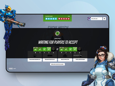
// OVERWATCH 2 // UX Improvements Pt. 1 – Searching for players.
"4 UX improvements for a delightful Overwatch 2 experience."
To tackle new UX/UI challenges I've heard about the knew release of the Overwatch sequel. I sign up to the Beta, played a few hours and made screenshots of crucial pits in the user journey. What meant to be a single redesign became a case study with more UX improvements that I initially planned. Feel free to check out the full case study tell me what you think 💭
Case Study on Behance:
https://www.behance.net/gallery/148432481/Overwatch-2-UXUI-Case-Study
Cheers...
More by Paul Trubas 🏆 View profile
Like
