Filter + Graph UI
So we had this feature in one of the apps in NCLVerse where one can filter through the question papers based on the share of each topics.
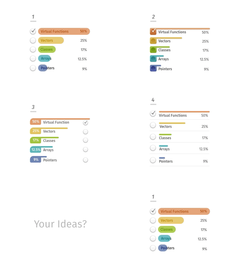
The initial direction we took for the design to achieve this had two parts. The first part was a filter where one can see both the topics and the share in text and the second part had the shares represented as bar graphs.The first part alone would have done the job but introduction of a bar graph made the share of topics “more“ visible which was not so when it was just text.
So we decided to incorporate the bar graphs along with the topic filters together at one place.
We went through 4 notable iterations, check them out with their rationales and cons in the attachment.
We welcome any ideas from your side that can make the experience better.


