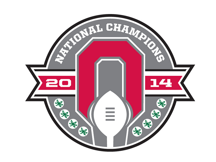
Ohio State National Championship
Here's a little something for my buckeyes out there. As a sports designer I was not overwhelmed by the national championship logo for tOSU. It was a solid, well executed logo, but disconnected with the fan base. The problem with these logos are they look generic, and I know the client drives the direction of these logos sometimes. They should have a home grown feel to them, because the local fan base are the people that are going to buy these items with the logo on them. Here my take on what the logo should look like. Thoughts
More by James Kuty View profile
Like
