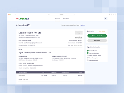
Finance, Accounting, Invoicing Platform - Invoice Creator Page
Presenting the design for a super simple invoice editor.
Here, the user can select from one of the invoice templates and can directly start editing it.
The checklist on the right-side panel indicates whether all the required and important fields have been filled or not.
Considering the Zeigarnik Effect, it is wise to provide these checkmarks, which help in reminding the user of the incomplete tasks.
Isn’t it good UX?
What are your thoughts on this concept? Let us know in the comments below.
We are experts in:
👉 More Info: Check our UI UX Design Studio website
Let's work together on your next project.
Feel free to reach out to us on: business@octet.design
Follow us on: LinkedIn | Behance | Instagram | Twitter | Medium
More by Octet Design Studio View profile
Like
