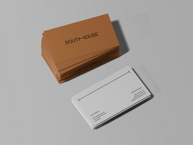
Business Cards Design
South House is a lodge hotel in Perth, Australia. The hotel is located in a quit forest area outside the city what makes it a place to escape. Combining urban design and country style, South House provides ultimate comfort, quality facilities, and exclusive service for guests seeking privacy and relax. The hotel idea is a mixture of city and country vibe with lots of wooden elements, modern aesthetics, and local authenticity that makes up a cozy ambiance of feeling at home while being in the nature.
The brand identity's goal was to communicate the South House’s philosophy as a brand, more than a hotel. In order to achieve that, the focus was made on a diverse color palette and simple typography. The color palette consists of nature-derived oranges, greens, and greys — no vivid hues, what immerses in the atmosphere of silence and comfort. The typographic logo is based on a sans serif type with a bed symbol in it. The symbol got expanded into corporate graphics — a line that navigates and decorates. The combination of serif and sans serif fonts in typography supports the brand's sophistication and modernity, while minimalistic style highlights its authentic tone of voice.
See the full project on Behance
Follow me on Instagram
_______
For project inquiries: contact@katezest.com
