Renovation company branding
Reinhart Renovation
redo houses to make them more modern and luxurious
My concept primarily emphasizes the modernity of the Reinhart brand. Simple geometric shapes inspired by avant-garde art form the letter R.
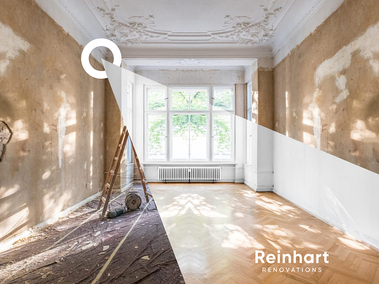
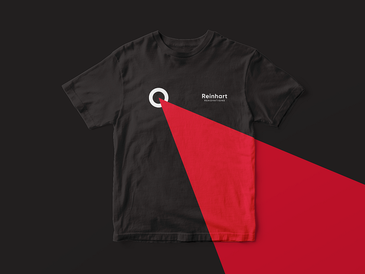
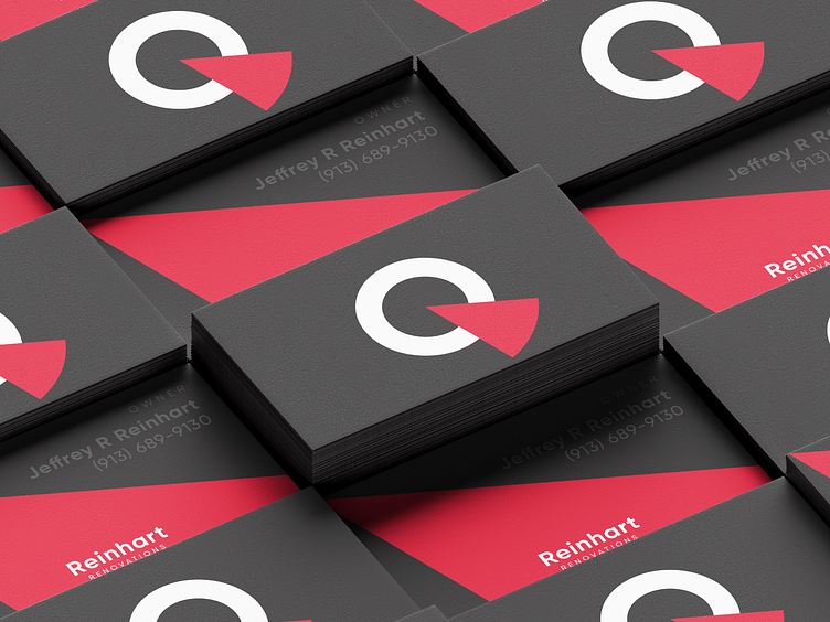
The shape of the logo itself was also not chosen by chance - the red sector, which goes beyond the circle, symbolizes a non-standard approach to renovation, going beyond, broadening one's horizons.
The expanding sector technique can be easily used on print and digital media to create a unified brand style.