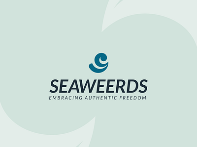
Seaweerds – Logo, Tagline, Narratives
Real adventure is full of twists and turns.
But that makes it more exciting.
Embrace it, and experience
authentic #freedom.
_
For full presentation (click here)
_
ABOUT THE BRAND
Seaweerds was founded by
three young professionals
who love to #travel and
seek #adventure.
They decided to establish
an #apparel brand and cater to
target market like them.
The brand name was derived
from the two words “Sea” &
“Weird” – misspelled as “Weerd”.
It represents freedom (Sea) and
being authentic to one’s self (Weird).
The name as a whole implies
“Authentic Freedom”.
Also, they are planning to collaborate
with environmentalists to help
in protecting #nature.
_
THE CHALLENGE
One of the co-founders reached out to me
and seek help in designing their #logo.
Upon knowing all information
about their brand, I found out
that they need clarification
to know what’s their personality
and how they should communicate
with their target market.
So we conducted a #discovery session
to align and clarify every aspect
of their brand before designing
their logo.
_
THE SOLUTION
We agreed to adopt “The #Explorer”
as a dominant personality and
“The #Caregiver” to differentiate them.
Therefore, 70% of their Brand Voice
should be exciting, daring, and fearless
while the 30% should convey caring,
reassuring, and warm.
Also, I’ve come up with a tagline
“Embracing Authentic Freedom”
as the core of their verbal identity
and where their logo was inspired from.
As you could see the incorporation
of wave (upper), road/check/smile (lower),
embrace (negative space), forming
their initial (letter S), and making
a subtle weird emoji.
