Calc Calculator Software Full Brand Identity Design
Calc Brand Identity Design
Calc is a new minimal and modern calculator software. Where users will get much more features than they get in a generic calculator. They want to provide so many kinds of calculation services in their software, at the same time they want to make it minimalistic and modern. Their target audience is new generations. As they have a minimalistic idea and concept, they need minimalistic branding too. So, here is what I've done for them.
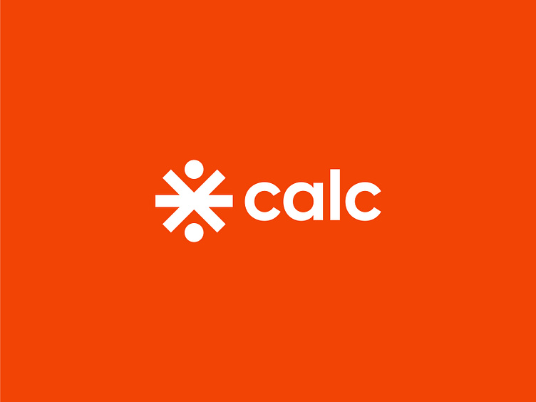
• In the beginning, when their product is an app, they need a logo icon or logomark to use it as an app icon, favicon etc. So, I've designed a minimal and clean logo mark which is meaningful also. I've added all the universal mathematical symbols which are, +(Plus) -(Subtraction) ×(Multiplication ) ÷(Division). It symbolizes what the company does. It also makes it very professional.
• After that, I've done a logotype too for the brand. I've focused on modernism and minimalism in the logo text too. To make it modern and minimal, I used a sans-serif font here which is very suitable for this type of company.
• Then I used an orange colour in the logo because it represents new generations. It attracts new generations when their target audience is exactly they. It also makes a thing exciting.
Here is that all, guys; I tried to create an easily rememberable modern and minimalistic brand identity with everything. I thoroughly tried my best to keep the identity minimal, simple and same time, professional. I hope you have liked it!
• If you liked it and are looking for a brand identity for your company, then hit me at any of the contact links below.
Mail: mdimtiazbrs2007@gmail.com
WhatsApp: +8801963851346
Other links: https://znap.link/mdimtiaz2007


