Cisco Network Simulator Redesign
Hi Everyone !
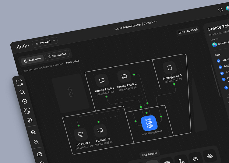
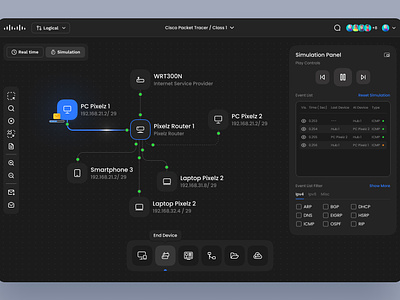
Continue to redesign from the previous shoot, this time there are several additional features with an attractive appearance
New Design for Physical Mode
using a simpler and clearer hierarchy will make it easier for users to classify the items in a layout. simple and clean.
New CLI code Hierarcy
Different from the text hierarchy used in the previous cli, this time I use color emphasis on the certain text that displays a special action. This will make it easier for the user and minimize the error rate in typing commands
New Device option Mode
Different from the previous design, this time I simplified the appearance of the device options. use the outline icon to make it look more minimalist with tab configurations to facilitate the process of selecting the device you want to use
Live Chat
With the addition of the live chat feature, it will certainly make the teaching and learning process easier. communication will feel faster and the time used will be more efficient
Let me know what you think and don't forget to press ( L ) if you like it.
Hope you like it 😄
Have a project idea? Let's talk, I'm available for new projects !
E-mail :grahacaesara.design@gmail.com
======================
Feel free to share your thoughts on the comment section.
Show some love by pressing “L”, and save it for later inspirations
Follow Pixelz Studio for more cool stuff.
======================
We are available to work on your awesome projects,
drop your business inquiry to :
✉️ E-mail : hello@pixelz.studio
💬 Skype : Connect with us
======================
Pixelz.studio || Instagram || UI8 Store || Creative Market


