(concept) Apotea mobile remake #2
Today I experimented a bit with the menu. My thought is to bring the menu in from right as one big green area with a little opacity. The search is as high as possible to always be one click away. The big categories is gathered in dropdown boxes.
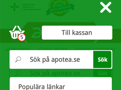
Added a cart. Still a draft, feels like it flies a bit in the design. Needs to get this tighter.
See the whole ting on: http://patrikjarl.se/labs/apotea/150121-apotea-startpage-w-menu.png
Ps. Added a link to the first picture too... go there and check it! ;)
