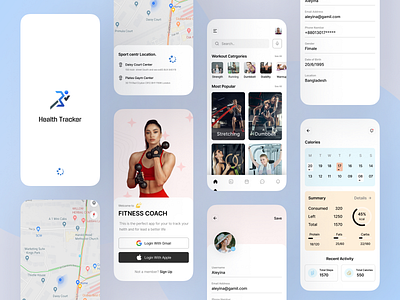
Workout APP UI
Hi all,
Today I want to confess to you…
Admit that I have made a lot of sports applications in my career, and in most cases, they are very similar. But this application is a bit different. I was starting with the style — ending with the main dashboard.
A brief background - my client is developing a variety of applications, and one of them is the Sports App. He wanted the design to be radically different from everything users are used to. So the first thing I did was change the main dashboard, and I drew inspiration from entirely different applications. The central and critical styles are fan illustrations and UI elements. The application also extracts information from related programs for tracking food, so it can display on the main dashboard how much you ate and how much you spent, showing whether you are low in calories.
The application is not better or worse than competitors. He’s just completely different, and this difference makes him cool. Do you agree with me?
Design — Figma
Want to Turn Your Ideas to Design?
Gmail: ridoyui2@gmail.com
WhatsApp: +8801301759109
Dribbble: https://dribbble.com/ridoyui2
Behance: https://behance.net/mdridoyahmed4
Instagram: https://www.instagram.com/ridoyuiux
Uplabs: https://www.uplabs.com/ridoyui2
