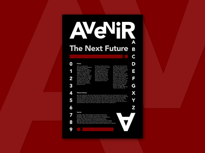
Avenir Typographic Poster Design - Typography Poster
Avenir Typeface Connotations:
When the word "avenir" comes to my mind, I immediately think of the future. The Avenir typeface reminds me of the geometric sans-serif typefaces popular between the 1920s and 1930s. When I see Avenir in books, screens, etc., I feel comfortable reading it, and it motivates me to read more due to its clean and modern design. If my typeface were a person, it would have a modern personality.
History:
Avenir is a geometric sans-serif typeface designed by the Swiss typeface designer Adrian Frutiger (1928–2015) in the late 20th century. It was released in 1988 by Linotype GmbH with three weights, each with a roman and an oblique version, and used Frutiger's two-digit weight and width convention for names. The typeface family was later expanded to six weights, each with a roman and an oblique version.
Frutiger considers Avenir to be his best work and intends it to be a more human version of geometric sans-serif typefaces popular in the 1930s, such as Futura (1927) designed by Paul Renner and Erbar (1922) designed by Jakob Erbar. Avenir means "future" in French and hints that the typeface owes some of its interpretation to Futura.
In 2003, the City of Amsterdam began using Avenir as the principal typeface in its corporate identity, including the famous "I Amsterdam" sign. In 2012, François Hollande used Avenir in his campaign materials during the 2012 French presidential election. In 2014, French railway company SNCF used Avenir for communication and advertising. Avenir was used by many famous companies and brands in their products, such as Apple, Snapchat, Bloomberg, Disney+, the BBC, Best Buy, Toyota, Land Rover, etc.
Physical Features:
Sans-serif typefaces like Avenir that use minimal geometric forms are called geometric san-serifs. They first appeared in the early 1920s and are characterized by geometric construction suggesting use of a compass. Avenir has physical features such as thicker stroke verticals than horizontals, classically drawn lowercase, short ascenders to aid in legibility, and a small x-height. Avenir has characteristics such as a circular O, a horizontal tail on Q, a squared-off end to G with a bar extending to the left and a flat section below, a double-story, a single-story g, flat top vertices, a pointed bottom vertex on M, and a lowercase f taller than the uppercase F.
Sources:
Wikipedia: https://en.wikipedia.org/wiki/Adrian_Frutiger#Avenir
MyFonts: https://www.myfonts.com/collections/avenir-font-linotype
Right Reading: https://www.rightreading.com/typehead/avenir.htm
YouTube: https://www.youtube.com/results?search_query=avenir+typeface
Thanks for reading!

