HYPERMED Brand Identity
HYPERMED Brand Identity
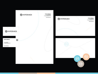
HYPERMED is a modern, wide-ranging Medical Center.
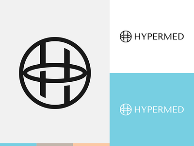
The logo is a stylized letter "H" combined with a circle shape, which symbolizes benevolence, gentleness, unity, stability. The strict, straight lines of the symbol and font demonstrate the brand's precision and impeccable approach to providing its services.
You can see all project and appreciate it on my Behance
More by Alex Escu View profile
Like

