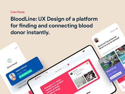
Case Study: Bloodline find and connect blood donors
Hello, creative UXers!
There are 1.2 million bags of blood needed daily in Bangladesh. Blood is the thing we have to donate. A lot of people with brave hearts are willing to do so. But the problem is that, when one needs blood in an emergency, he faces a hard time contacting donors directly.
Maximum users don't feel it safe to collect blood from the blood banks. On the other hand, the blood bank procedure to collect blood is not accessible to everyone.
So there is a gap between blood recipients and blood donors and I tried to solve that by designing a dedicated mobile app and mobile-first responsive website (progressive enhancement).
It's my detailed UX design case study on how I approached the design and how I made it accessible. I expect your honest opinion and suggestions about how I can make things better next time.
🌐 See my other case studies here:www.mafruhfaruqi.com
