Buddy - Dog walking app
Helping dog owners find trusted
dog caregivers in their neighborhood
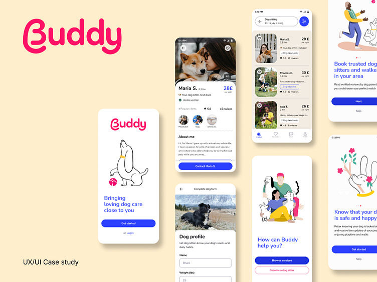
Buddy is a mobile application that easily and simply connects dog owners with local dog sitters and walkers.
The challenge was to design the mobile application to be user-friendly and
help dog owners gain peace of mind by providing them an easy-to-use platform to reach reliable and verified caregivers.
My role: over the course of three months, I spearheaded the user research and design of the app. Through a mix of user interviews, iterative prototyping, and testing, my goal was to take a broad idea and deliver something valuable to our users.
Problem statement
Dog owners sometimes need help caring for and walking their dogs.
Whether they have to go on vacation or a business trip, whether they are sick or injured, they need a trusted dog sitting and dog walking service to rely on.
Dog owners need to trust their dog caregivers deeply.
Our goal was to help them find that trust and reliability while providing a seamless user experience.
Uncovering the user needs
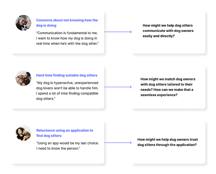
Before imagining the first screens we immersed ourselves into the user’s needs and pain points. We conducted five semi-structured interviews with the two main target groups: three dog owners and two dog sitters who currently use dog walking applications to provide their services.
After analyzing insights and pinpointing problem areas when choosing a dog sitter, we created How Might We questions to ideate our solution.
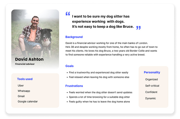
Research, insights, and data points were channeled into the creation of key user personas to shape the product strategy and empathize with the user throughout the whole design process
Deeper insights
Combining user interviews with competitive’s research, we were able to have a more clear vision of how we could improve a service that is already established on the market. User feedback indicated that existing dog walking apps struggle with usability issues: people found the flow unintuitive in some parts, such as when managing messages in the chat section.
Moreover, interviewees with particular types of dogs, such as active breeds, expressed the need for a more efficient filtering system to tailor the research to their dogs and ultimately gave the user more control over the whole research phase.
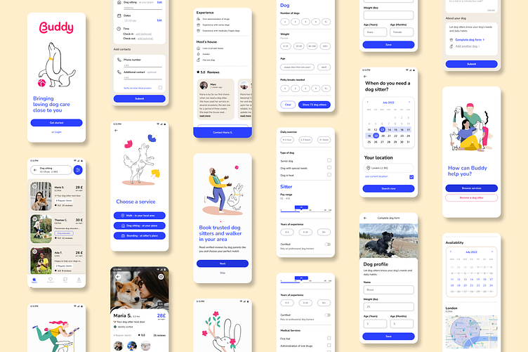
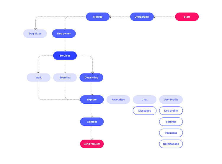
Below is how the application layout was designed and what flows of interactions were planned to address the mentioned needs.
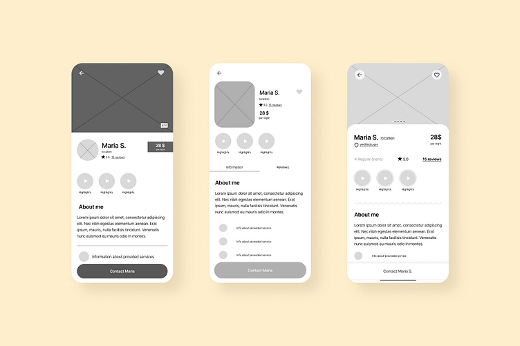
Dog sitter profile: wireframe experimentations
Design
We built the visual concept around the feeling of community and
authenticity.
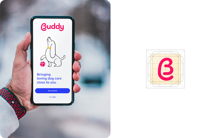
Blue tones for buttons and main UI elements complement the logotype, which
with rounded strokes and long tails for the letters B and Y, sets the visual association with the dog world.
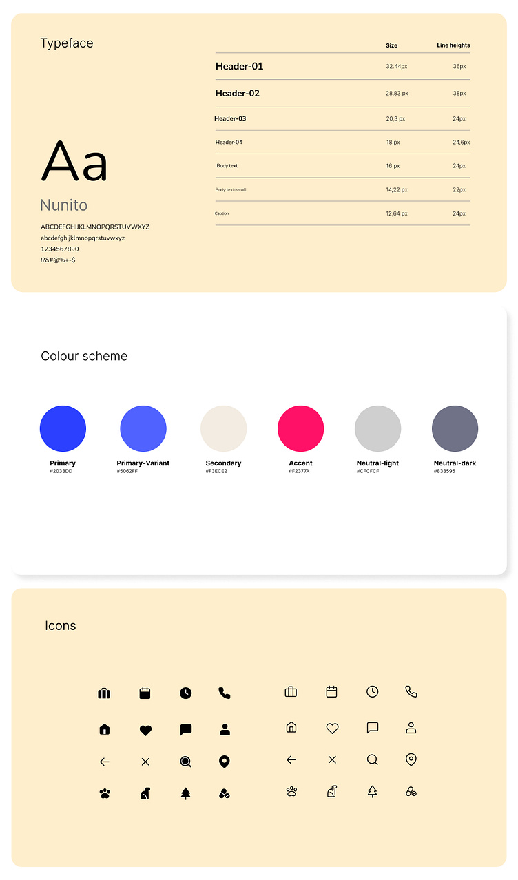
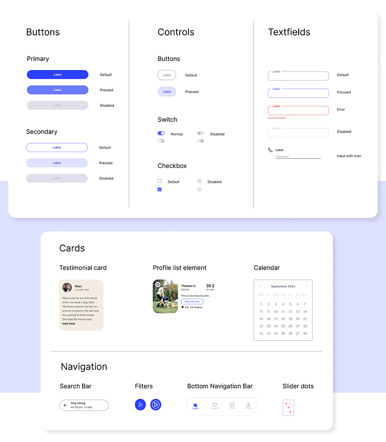
All components have been built in Figma with auto layout.
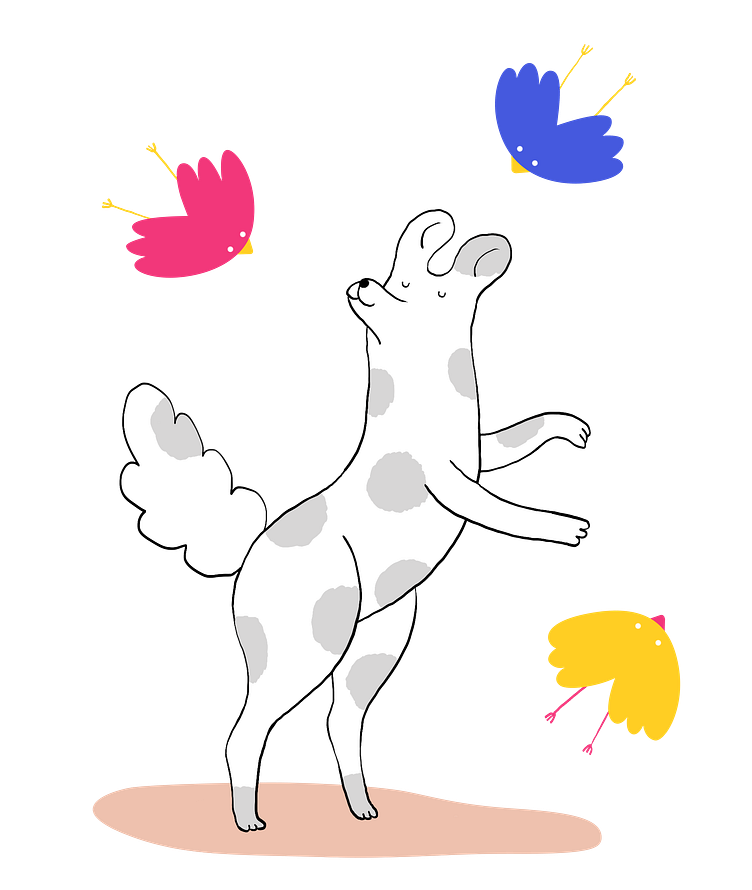
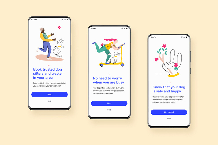
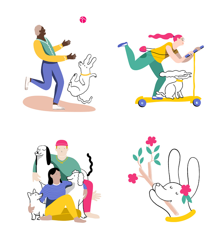
Onboarding
For the onboarding screens I created custom illustrations that support the user experience with the power of storytelling. Together with explanatory headlines, they work as the primary tool for informing users while instantly setting the emotional and aesthetic appeal.
Clear CTA elements are seen instantly to focus the user attention on the core interactive zones.
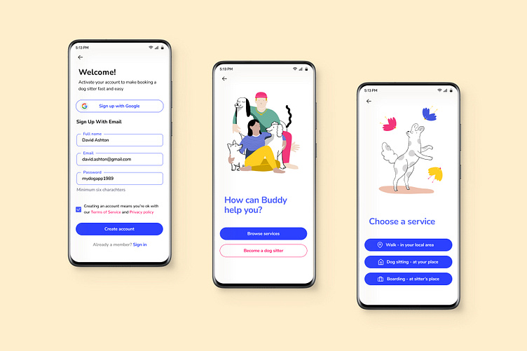
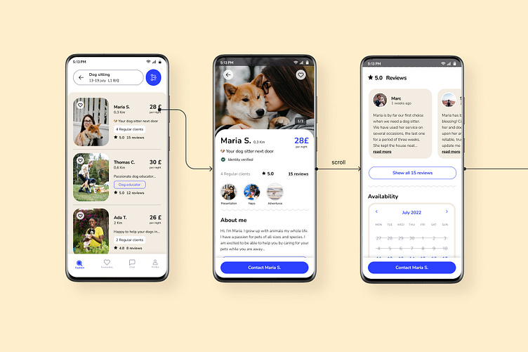
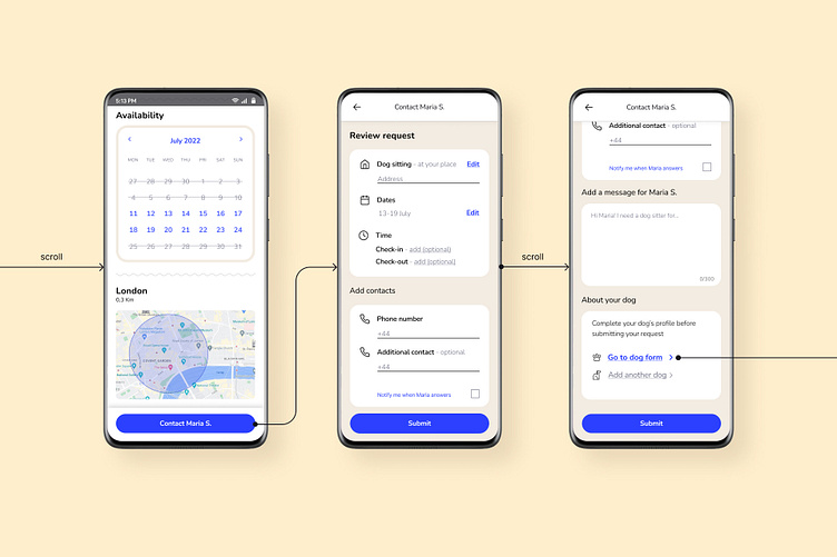
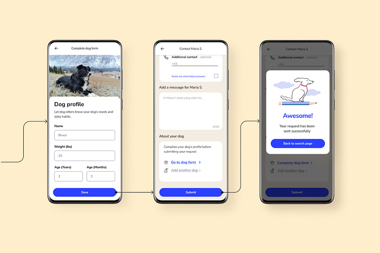
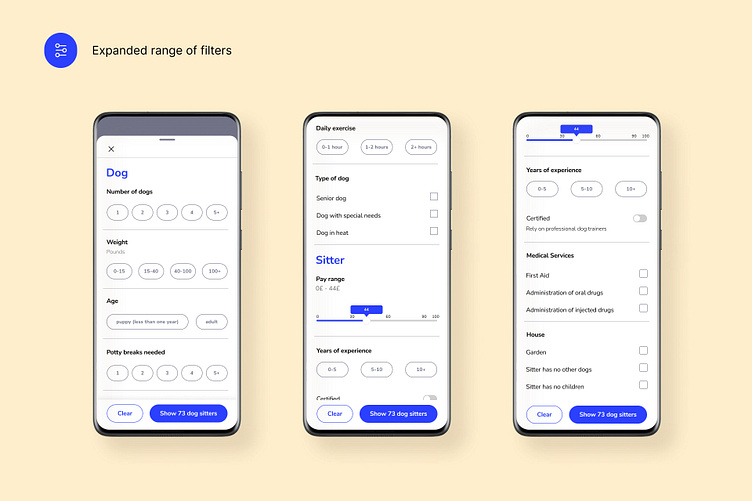
Booking a dog sitter
The simple and clear system of filters allows the user to choose the most suitable settings and tailor the research to his/her own specific dog.
Together with reviews, we introduced the possibility for dog sitters to add presentation reels in the format of tappable video highlights to get dog owners know dog sitters instantly and reduce trust issues.
Iterations
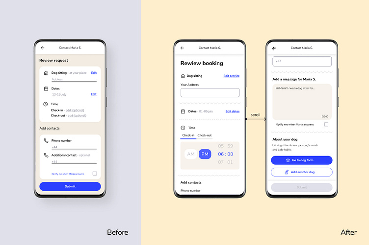
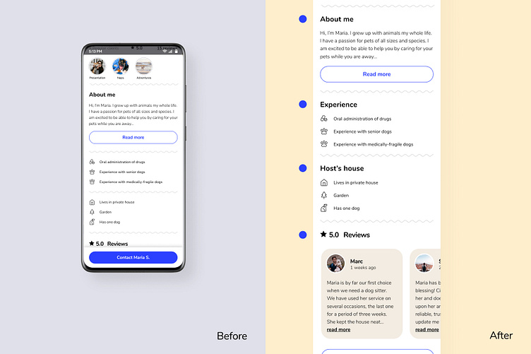
After testing the prototype with users, we made changes to improve the user experience even further:
Improved consistency of the User Interface of the Booking page
Introduced clear titles to every section of the dog sitter's profile page: text paired with icons was still not enough for users to understand services clearly
Learnings
This project was an exciting challenge, requiring a well-thought balance of clear and accessible functionality and stylish visual concepts corresponding to the theme of dog care. Here are a few takeaways I got from working on this project:
Return to research multiple times
Beliefs tend to take over the decision-making process, and it’s our responsibility to be aware of them and maintain a user-centric position.
Come back to personas often during the whole process and ask yourselves: why are we doing this?
Embrace mistakes
Solving a problem implies a lot of trial and error; while it's easy to stick to the first valuable ideas, it's much worth challenging them and exploring additional solutions.
Share the process
As the saying goes, two heads are better than one. In product design, the more heads, the better. Working with my class during the research and ideation phase helped me gain a much deeper perspective on the whole work.