Beverage cans
Beverage cans
The challenge was to develop a new mixed drink line for my virtual bars in Tokyo and New York. Which expands without problems, but clearly remains in the same strict line. Also, the line should reflect the bar feeling of the late 50s.
Distribution is via supermarkets, beverage retailers and the Internet. The drinks are priced in the mid-range.
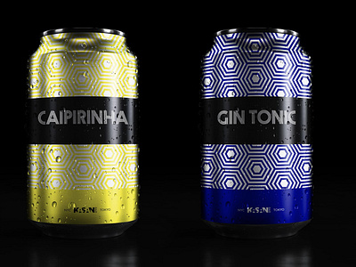
Font During my search, I came across the font Prisma by Dieter Steffmann. It embodies exactly what I was looking for. I think it works great for my beverage line, as I use the nested hexagons as a pattern on the entire can. Additionally, it also reminds me of neon lettering, which is wonderful for a bar.
Color concept The color choice is strong with saturated colors. This clearly distinguishes the various cans from each other, but still in harmony. In addition, the cans clearly stand out from the competition and catch the consumer's eye on the shelf.
Have a Project? Let's Talk! kasan@kasan.ch
