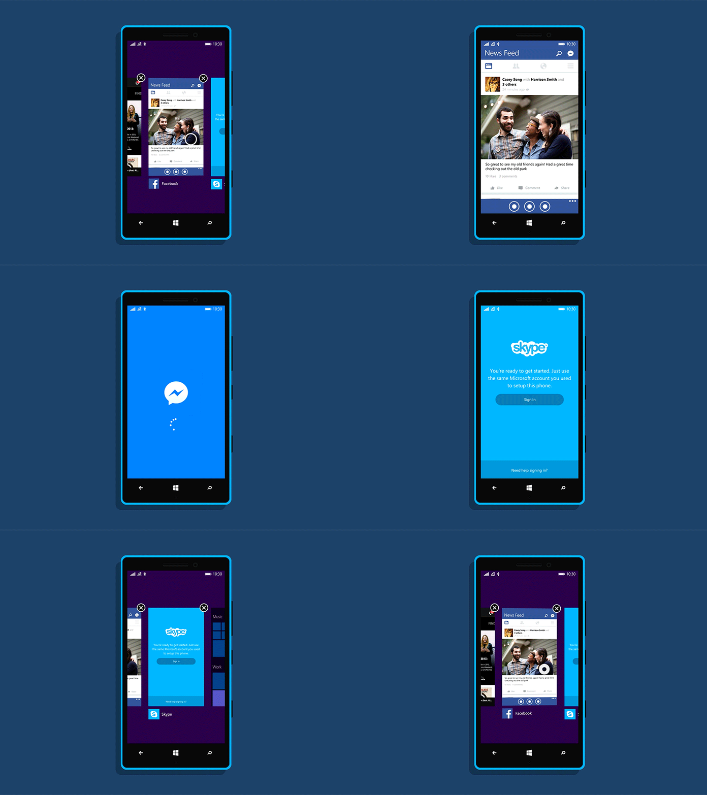
Multitasking
Expanding on my thoughts on motion design here and here, I've done a first pass at improving multitasking on Windows Phone. The system in place is unfortunately rather confusing at the moment, as illustrated by this conversation.
One solution is to introduce a new animation that makes it clear that a new app is being launched. The first part of this solution can be seen in the new opening animation that now differentiates itself from in-app transitions. The second involved a new, more intuitive transition when switching between apps–particularly when one app launches or links to another.
To demonstrate this I’ve made subtle tweaks to the Facebook and Skype apps for Windows Phone. Mostly just improving contrast and making action items more distinct, but I think they both improve the experience and help create cohesion with their apps on other platforms.
Note: I've used Areus Wade's excellent Pre-Comped Touched Gestures.


