The new Defringe, an online gallery.
Hey guys!
A new version of http://defringe.com has just launched. I consider this 4th version has forced me to discover new techniques and solutions. I would like to explain some small things and ask for your opinions.
> You can read the full article on our lessons learned & applied on Medium https://medium.com/@defringe/lessons-learned-in-four-years-of-blogging-155eeb8e63d6
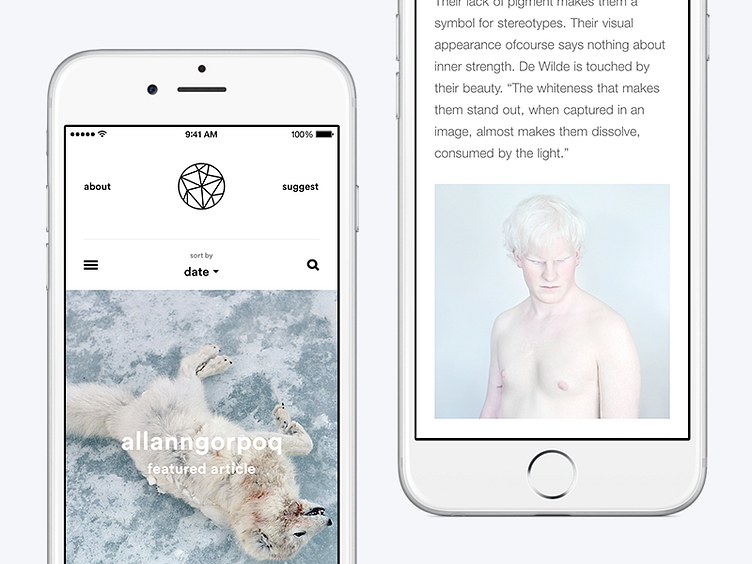
Defringe is an online gallery filled with inspirational visual content. With the idea of a gallery in mind, the grid design, navigation and overall feel are really important.
A staff-picked featured post with a huge image welcomes you to our gallery. It should give a sense of luxury and quality. Below the big image, three columns with content enables the visitor to get a quick overview of the latest posts.
The clever pagination-slider is fun to use and invites visitors to dig deeper into older posts. At the bottom of the page, you will find three more staff-picks, the moodboard and social channels. I hate dead endings.
The design is constructed around the content. It should not be overly present except when you need it for navigation. In a post, large titles on both sides make navigation easy and attractive. Toggling through posts horizontally gives that seamless app-feel without making it too fancy.
Have a look. I would really appreciate your opinions and some constructive feedback.