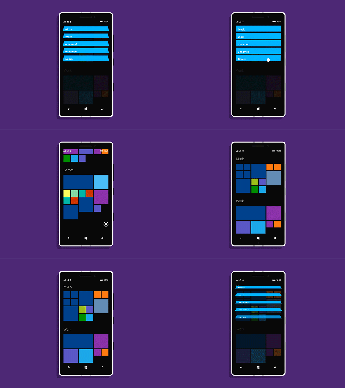
Start Screen Groups + Quick Jump
Hey folks,
I've done some thinking about perhaps the most identifiable feature of modern Windows: the Start Screen.
While most OSes divide the user's content into multiple home screens, Windows Phone places all of that content into a single list. The more content the users adds, the more difficult it becomes reach items at the bottom of the list.
Microsoft has tried a few solutions for this, but they've had a few discoverability and consistency issues.
Here's a slightly different take.
Windows 8-style groups allows users to better organize and manage their pins, while Quick Jump allows users to quickly move between each section. This effectively shortens the length of the Start Screen by allowing the user to jump to a particular type of content with just a tap or two (and without passing through several discreet homescreens to do so).
And, unlike the current folder solution, this doesn't have any negative effect on the platform's signature Live Tile functionality.
Thoughts?
