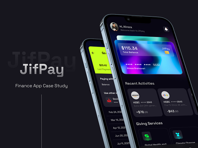
JifPay - Finance App Case Study
In this case study, we'll describe our design process and the artifacts of our recent FinTech design project, JifPay.
Download the UI kit for this project here.
As an international payment provider, JifPay enables people to transfer funds worldwide. Besides, Jifpay is a personal accounting assistant with tools for managing your cards and categorizing your incomes and expenses. However, the features of Jifpay do not end there; loans, statistics, credit score, reload phone, and balance wallet are just a few.
01 | Our Design Process
Our UX/UI design process will start with User Research. For this project, we limited the research to UX Benchmarking to truly grasp how users use and think about the interface. Then, we used these results alongside business goals to craft the User Flows necessary for delighting the users. Based on the User Flows developed, we then created several solutions in the form of Wireframes for each flow to brainstorm different ways to solve the users' problems. Finally, we selected the most promising Wireframe for each flow, iteratively built the design system, and used it to design the final User Interface.
02 | User Flow
Here you can see the User Flows we designed for Cash Pickup, Split the Bill, and Reload Phone flows. We use User Flows as a communication tool to create alignment across all project stakeholders before investing too much into the final User Interface.
03 | Wireframe
These are a handful of Wireframes we designed for this project. Wireframes will help our clients take a peek at the final UI while having enough flexibility to change direction quickly. They also help prevent rework and ultimately enable us to have a quicker lead time and maximize the ROI of our clients.
04 | Design System
We construct a full-blown Design System for all our projects. It is a collection of reusable components, typographies, color palettes, patterns, and guidelines for using them. The Design System helps create a consistent experience across various features or products even if we are not there for our clients in the future. In addition, our Design Systems will consider the client's brand guidelines and tone, that in turn helps us craft designs consistent with the client's website and the rest of the products and services they offers.
05 | UI Design
With all the pieces in place, we finally iteratively designed the final UI, getting feedback from our client at every step. It is worth noting that this step goes hand in hand with creating the Design System. That's why we call it an iterative process. Here are some of the final screens we designed for JifPay.
06 | Credits
Designed by Alireza Shahsavary for Duxica.
07 | About Us
We are a Canadian design agency that helps startups and growing companies turn ideas into exceptional digital experiences. We can help you with every design need: UX/UI, 2D/3D illustration, branding, animation, you name it.
Need help with your design? Drop an email to design@duxica.com.


