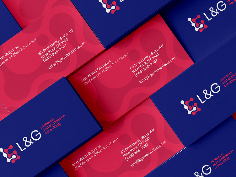
L&G | Logo Refinement + Brand Evolution
L&G wanted to evolve their brand while maintaining the same look and feel. Before we started with brand style, we recommended a polish of their existing mark.
The mark had disproportionate hierarchy in their original logo — putting much more emphasis on the research component of their work. We recommended an reorganization of their mark and emphasis on L&G as their business name, with the research and evaluation consulting equally secondary as what they do.
Their original logo was also warped and inconsistent in it's shape so we reshaped it using an underlying grid — while maintaining maximum recognizability.
We defined a playful illustration style to reflect the approachable and optimistic nature of the brand — as well as a style the client could easily find more stock assets in.
—
brightbase
A better creative service built around your business. brightbase is the new alternative to freelancers, agencies, hiring, and subscription services. Fast, flexible, full-service creative and web teams. Made to scale.


