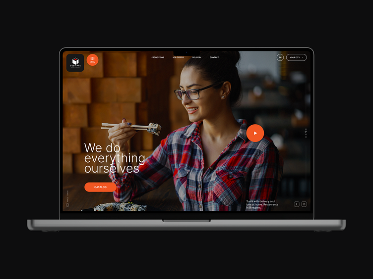
SushiPak
When you are working on an interesting project, and when the customer listens to you, you always want to do better, offer to improve the interface for potential buyers. In this project, the customer and I are on the same wavelength, which is very cool. Since there is a block with an address in the product catalog, and the customer insisted that he stay, I, for my part, offer a small improvement. To make the block static, as well as the card page turned into a pop-up window, which is much more convenient for this category of goods, there are other options in a dark style. This is not new, but it interacts more effectively with the user. Also, the main page will consist of four blocks, the main screen, a mobile application, gift cards and new items, because new packs and various yummy things are often invented, and they need to be thoroughly shown.
P.S. The basket is added when the goods are added to it.


