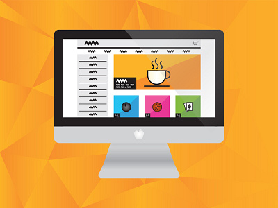
Web Design Icon
Testing some new colors and graphical elements in rebranding The Presenters. I'm trying to mess around with vibrant colors.
The 2 tone shaded backgrounds were an idea I got after designing with a smudge on my screen. Seems to work out!
Thoughts or opinions?
small line icons by Pixellion found at Creativemarket.com
More by The Presenters View profile
Like
