Email Desktop Application
Project Overview
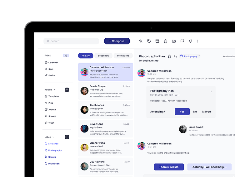
The modern online entrepreneur needs an email client that is fast, efficient, and a little less formal. How can we simplify and reduce the amount of time spent on email applications? Emailarize is an email application with a more efficient way to communicate, a causal interface, automated functions, and overall reduces clutter.
The user persona was already created along with the colors and typography according to the project brief. I was the sole designer for the rest of the project conducting the user research, competitor research, laying out the project goals, the wireframe, UI designs, prototyping, and testing.
User Research
I conducted user interviews with a range of people to learn about the various issues users were having. I asked 12 questions in my user interviews and gathered important data and feedback that got me one step closer to solving the users problems.
Users current pain points:
Inbox gets too cluttered
Overwhelming, hard to see what’s important
Too much spam and junk mail
Too professional
Too many colors
Inability to tag emails
Accidentally archiving instead of deleting
Not easy to categorize
Features that users would like:
Easier to group emails
Get rid of the clutter easier
Add signatures easily
Have templates so it’s faster when sending the same type of emails
Sorting systems such as color coding or labels
Custom tagging
Automatic categorizing
Easier to remove junk mail
Competitor Research
Compiling competitor research was a great way to dig into how each of the main email brands are organized, along with their pros and cons. I focused on the two main email applications that came up in my user research - Apple Mail and Gmail.
Problem Statement
After gathering the information from the initial research and with the user persona, Sasha in mind, the main goals for this project are:
Have the user interact with email more conversationally - threaded chat style email view
Canned responses + templates
AI driven suggestive text
Smart folders and filters topical organization
Reduce the user’s time in email
User Flow
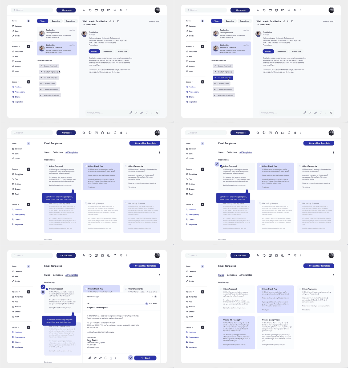
The main user flow was created with the goal to simplify and reduce time in email applications. I wanted to incorporate a smooth sign-up onboarding to add the user's information, sync other email accounts, and contacts. The users can then use canned responses or choose and edit templates for ease of messaging = less time writing or thinking of emails.
Wireframes
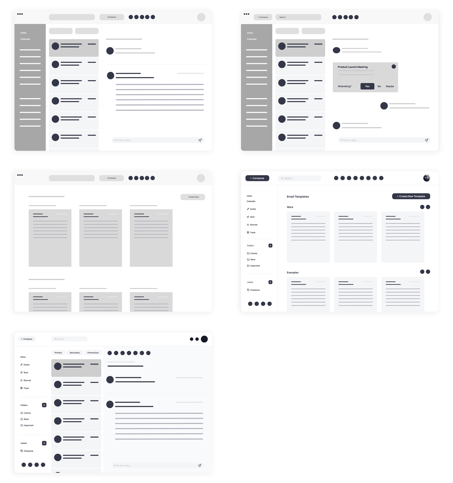
First sketches and then low-fidelity wireframes got the sense of layout in the email application and ways to incorporate the main project goals. Explored ideas for the top navigation, search, compose button, a space for icons, profile, primary messaging layout, chats, and a nav with the main email elements.
Prototyping + Testing
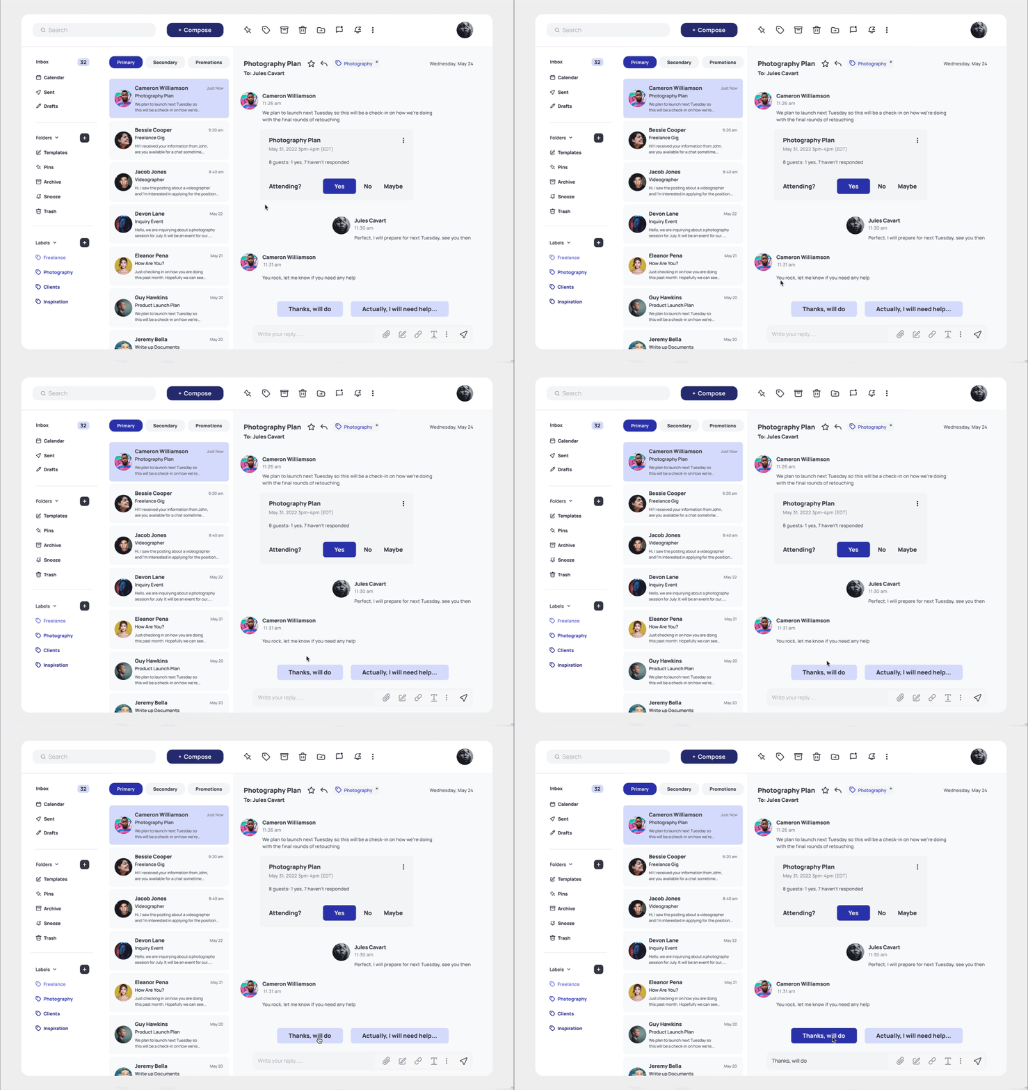
I started with a user test of the wireframes; shown below is the transition from the wireframe to high-fidelity after the iterations. The inbox setup with Primary, Secondary & Promotions had the most positive user feedback of automatic organization and seeing the important emails but I made various changes (highlighted in the bullets below) based off great user feedback from both rounds of user testing.
Some iterations based on feedback from both rounds of user testing:
Narrowed down the hierarchy, copywriting, and design within the left navigation
Added the Calendars icon below the Inbox as many users said this was very important to them
With the first user tests, a couple of users found Labels more useful so I adjusted the content in Folders so Labels can be used for users tagging + organization (but if they would like to still create custom folders the option is still available)
Moved the row of email action icons in the nav bar for easy access
Echoed the same icons in the Folders tab on the left navigation with the copywriting so it’s in both places (echoing the 3nd feedback point)
Added the icons for attachments, links, templates, text styles + more settings in the email chat reply
Moved the search to the left so it was apparent and not in the middle
Made the compose button larger and a different color to be more apparent
Added a carrot dropdown for Folders and Labels so they can easily be opened or condensed to take up less space
Adjusted the labels when an email is open so it can be edited or removed
Added a clear way to click on canned responses when replying to emails
Simplified the templates page so it was more straight-forward based on user feedback and easier to use
Final designs are shown in these final prototypes.
Final Designs
Utilized a created color and typography library for the branding, keeping minimal colors and different shades of blue to differentiate from competitor brands. These are the final design screens based on all the user research, planning, wireframes, testing, prototyping, and iterations.
Outcome/Results
The process of creating Emailarize gave me some time to explore more user research skills and how important it is to first talk to users and find out their pain points and what they need. The main project goals were completed to ship out the MVP.
Looking back at the project, I would like to spend more time crafting the experience of canned responses and templates to make it even more efficient for the user and ways to make sending a new email a little more casual. I also would have liked to spend more time prototyping screens and work on creating some micro-interactions within the experience.
The next step of the process would be creating the mobile web browser and mobile application. But overall, this project gave me some great perspective into the product design process and growing skills within all fields.


