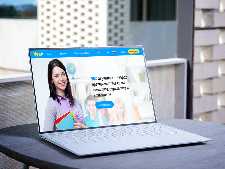
Website redesign - Ucha.se
The challenge
Ucha.se is the leading service for providing online lessons to primary and secondary school students in Bulgaria. However, it represents a number of problems in terms of its usability and visual design. This challenge focuses in particular on the page dedicated to teachers, who are some of the primary users of the service. The main objective of this page is to motivate potential customers to look for more information on discounted subscription plans for schools. The current page, however, is not very effective in meeting this goal as the information is not organised in the best way, lacks clear visual hierarchy, relies excessively on text and fails to use white space to its advantage. It also presents some drawbacks in terms of its layout, making excessive use of centrally aligned paragraph text which is bad practice in web design.
Below is a print screen of Ucha.se for Teachers, last accessed on 28.07.2022:
My solution
I reorganised the information in the header, footer and main page body to make to more relevant and targeted to to the users. I rearranged the order of sections to make a more compelling case for the call to action, changed to hero image to one which works better with the text, used the grid to add some more visual interest and revisited the typographic hierarchy. I also removed what I considered a superfluous slider in the testimonials section (sliders are not best practice in this case as they can create the illusion of completeness, while it is best in this case to keep all the information visible at a glance). I made the main call to action section visually more appealing and improved the form structure. I also substituted the text explaining the two types of subscription plans with two cards and bullet points for better scannability and comparison. The footer was unnecessarily crowded so I removed some of the superfluous information such as the blog references and optimised the information structure for the site map.


