Website redesign - Swapcard Blog

This is a group project developed as a response to a design challenge. The group members are: Francesca Cosenza, Alessia Driza, Karen Aguilera, Maya Mircheva
Problem
The client Swapcard approached the organisers of the Design+Nocode Challenge, the Sherpa Community, with the request to launch a call for proposals for the redesign of their blog page.
There were several issues with blog page design: lacking visual hierarchy, unclear navigation structure, confusing information architecture which made finding relevant content difficult and failed to emphasize the the different content types present on the page.
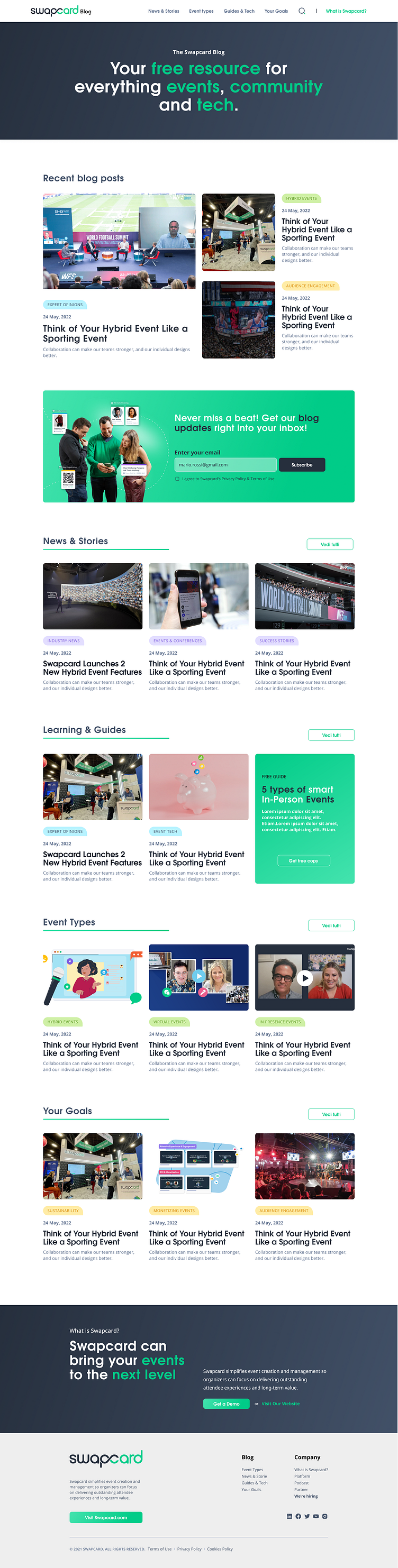
Screen capture of the blog page at the time of work:

Solution
STRUCTURE
Rather than proposing a unique grid of Posts Blogs in the home, we focused on designing a home page structured with:
A hero area
A recent post blogs section
A catchy newsletter section
Four sections dedicated to the four macro-categories.
A section about what is Swapcard with a link to the main website
Footer
CATEGORY SECTION
We redefined the taxonomy, organizing all the original categories into 4 macrocategories. In certain categories, such as “Learning and Guides”, we combined blog post tiles with CTA tiles. In this case, we thought it made sense to include a downloadable piece CTA, which was required by the brief.
LINK WITH THE COMPANY
During the analysis phase, we realized that it was hard for the user to understand what is Swapcard while navigating the blog. For this reason, we created a dedicated section that creates consistency with the company and represents a direct link to the company website. The same solution is proposed also in the primary navigation through the link “What is Swapcard” that opens a slide-in modal, which provides more information about the service.