Uphome - Construction Landing Page [LIVE🔥]
Hello Folks!
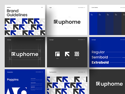
I’m excited to share the case study live website on Dribbble! This is my next exploration of Website Construction with an animation called Uphome. Here I rebound the logo that Faza created before. The website use yellow colors and combines a unique layout.
It's already live guys! I worked with Taufiq to develop this work. You can visit live on WEBFLOW. Cheers! 🤙
Full Page
Wireframe & Responsive
Typography & Color Palette
More by Odama View profile
Like


