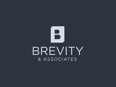
Brevity - Logo & Branding
I'm really excited to share the first piece of branding that I created with the team over at RFF. The client approached us while still unsure of what they wanted, and through the course of a few iterations we were able to produce something that conveyed a few of the key principles and ideas they stand behind. The name itself implies conciseness and a straight-forward mindset, and the mark had to match that philosophy. After toying with a couple abstract symbols, we went back to the drawing board and explored the use of shapes to form the first letter in their name, namely the letter 'B". The logo is intended to communicate a sense of sophistication, strength, elegance, and reliability within their field.
I'll be posting more of this project in the upcoming days and weeks, and you can also check out the website home page concept here. This is a final concept that has been approved by the client, however, I'd appreciate any feedback and/or thoughts nonetheless. Thanks!
Created with the Right Foot Forward team
PS: Check the attachments for high-res and mockups.


