Didn't make the cut 3
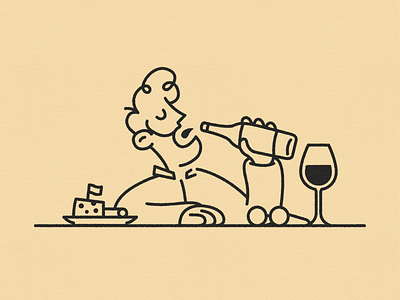
Part of an identity concept for a liquor store 🍾
The store was taken over by a new owner, who is an expert on different types of drinks but especially whisky's. The idea was to make a caricature of the owner and incorporate this into the new visual identity for the store.
In this one he's enjoying quite a bit of wine. Glasses are off which means his vision is blurry either way ¯\_(ツ)_/¯ This one could be used for different promotional material about the tastings he's offering in the store. Nice wines or whisky's paired with some good cheeses, meats and other delicious bites.
More by Remy van der Winden View profile
Like
