Didn't make the cut 2
Part of an identity concept for a liquor store 🍾
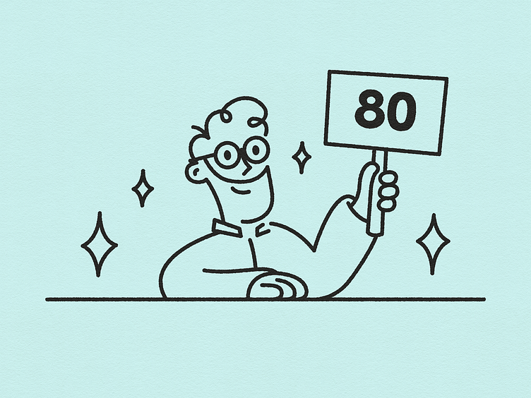
The store was taken over by a new owner, who is an expert on different types of drinks but especially whisky's. The idea was to make a caricature of the owner and incorporate this into the new visual identity for the store.
Here he gives his rating to a product he is selling. This variant can be used in leaflets, flyers or on the shelves to let customers know what he considers to be the best products.
More by Remy van der Winden View profile
Like
