JAMPAG SERVICES LIMITED - LOGO DESIGN
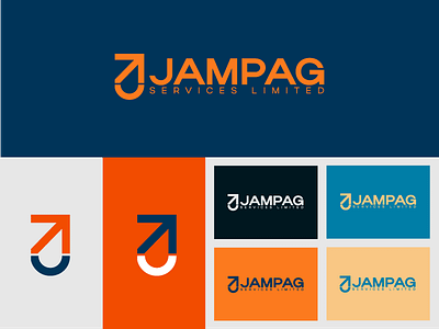
This is a minimalist logo consisting an arrow pointing upwards and
has a curved shape as the base.
The arrow represents movement, transportation, commercial trading
activity and with creative eyes the curved base shape in combination with
the arrow forms an abstract “J” which represents for the the initial letter of
the brand’s name.
Link to my portfolio https://www.behance.net/danieladorkor
