Gleebox Mobile Product Design
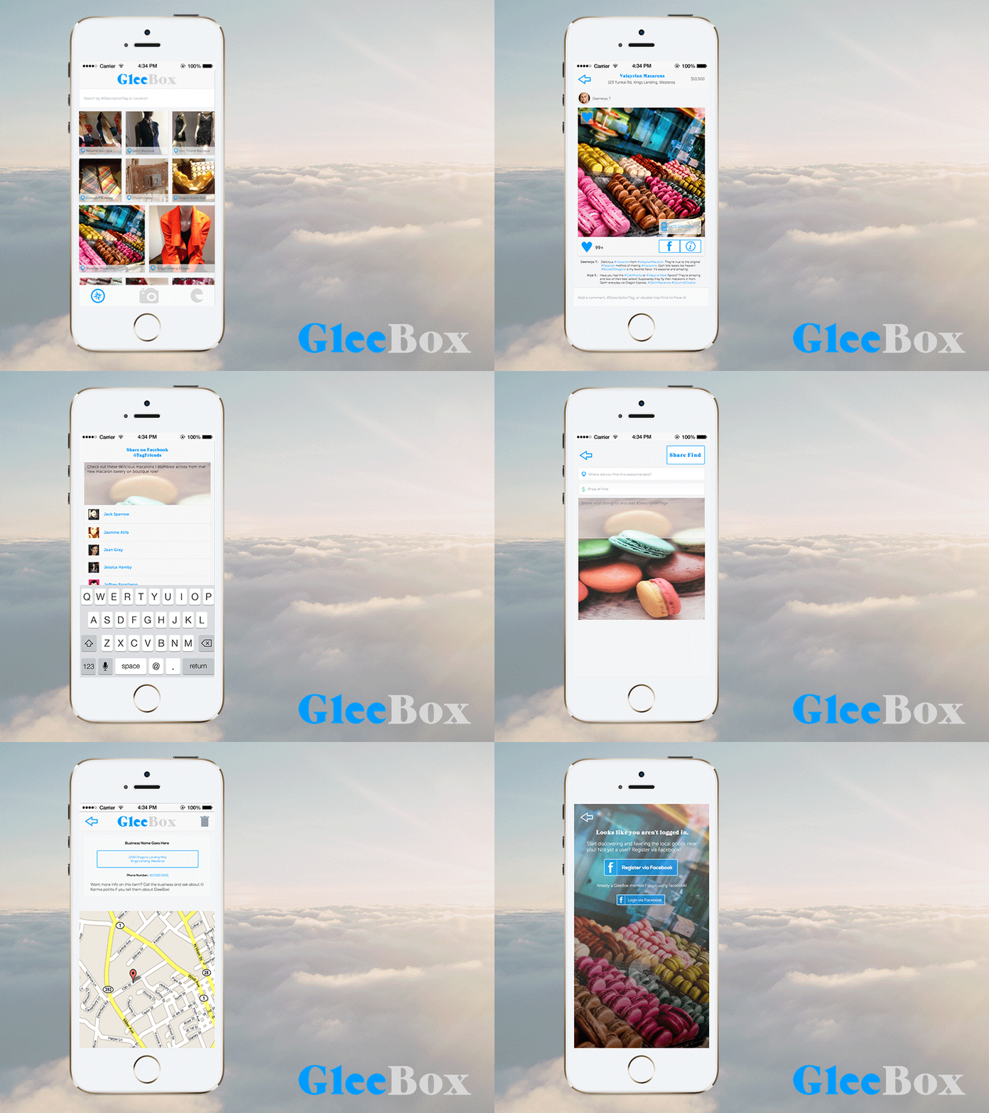
#TBT...Throw Back..err, Tuesday? This is the final iteration I did for Gleebox - a more social way to discover local goods around you and globally. Based on user behavior from the internal analytics dashboard and user feedback, changes were made to make the product more sticky. Users could discover local goods, call the business, and map the location - all directly from the app.
Users could also share Finds with their friends on Facebook which shows up as a story on that person's Timeline. When anyone interacts with the story, they are directed to a web view of the Find (on desktop - on mobile, they receive a responsive version). The web view's purpose is for content consumption, showing an image of the Find, business name, business information, and comments. Only users that have logged in are able to add content in the form of Finds or comments.
I did all user research, user experience design, and the user interface. I also worked with a team of extremely talented engineers to ensure pixel perfection, interaction perfection, technical feasibility, and on-time delivery.
Real pixels are attached


