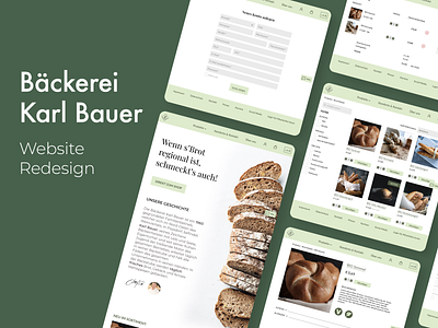
Website Redesign for Bakery Karl Bauer
View the full case study on Behance
Purpose-driven vision
The bakery's vision is to make regional and sustainable bread/pastries that are affordable and accessible to all.
The Challenge
Re-design of the Bakery Website
The old website was outdated and needed a refresh. Additionally, the client wanted an online shop to sell their products online. The website should not deviate too much from what the existing customers are used to, but enough to give a new and modern look.
Our Approach
We reflected on the current website and started with personas and information architecture. After we did some research, we iterated the personas/information architecture and went on to the next step. We based the first wireframes on previously made sketches. Since the client produces and sells sustainable and regional products, one of our goals was to give the website a refreshed green look. We, therefore, changed the colours of the logo but kept the shape.
Then we made a high fidelity prototype to test the new design. We’ve conducted usability tests and found the main issues. The iterated version of the prototype is uploaded here.
Team: Alexey Chernikov, Anna Großalber, Lidija Grujin, Leo Lehner
Role: Research, UX/UI Design, User Testing
Scope: 3 weeks, as part of UX Design Bootcamp
