UX + UI Writing Challenge #4
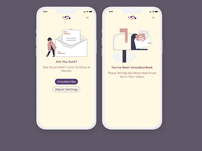
I really had to shorten my text to fit within the constraints. I wanted to keep the tone light-hearted with the 'Too Much Mail' it reminded me of the Got Milk ad when I say it in my head for some reason. From the first screen, the flow can branch off into two directions. To stay within the screen limit, I showcased the unsubscription flow. The other flow would have taken users to the settings where they can customize how regular they receive newsletters. In regards to typography and colour, I wanted to communicate 'soft'.
Scenario
• User opens a newsletter in an email and clicks the unsubscribe link.
Challenge/Constraints
• Ask user if they are sure they wish to proceed with unsubscribing from the newsletter.
• Headline: 20 characters max
• Body: 40 characters max
• CTA button(s): 20 characters max
• Screen limit: 1-2 screens max
Deliverables
• Visualize with UI as a popup modal as either Web or Mobile.
