Rezieo™ - Web Application
Design I did for a SAAS web-app that allows for On-Demand Video Interviews.
With Rezieo you can understand your candidates holistically. Vetting only the top candidates that really fit with your organization. Simply send a link to a promising candidate and the Rezieo app does the rest. Invite team members to view and rate candidate's recorded interview video. Then see quickly who will be a good fit for the position and your people.
Simple, Affordable, and One Flat Rate.
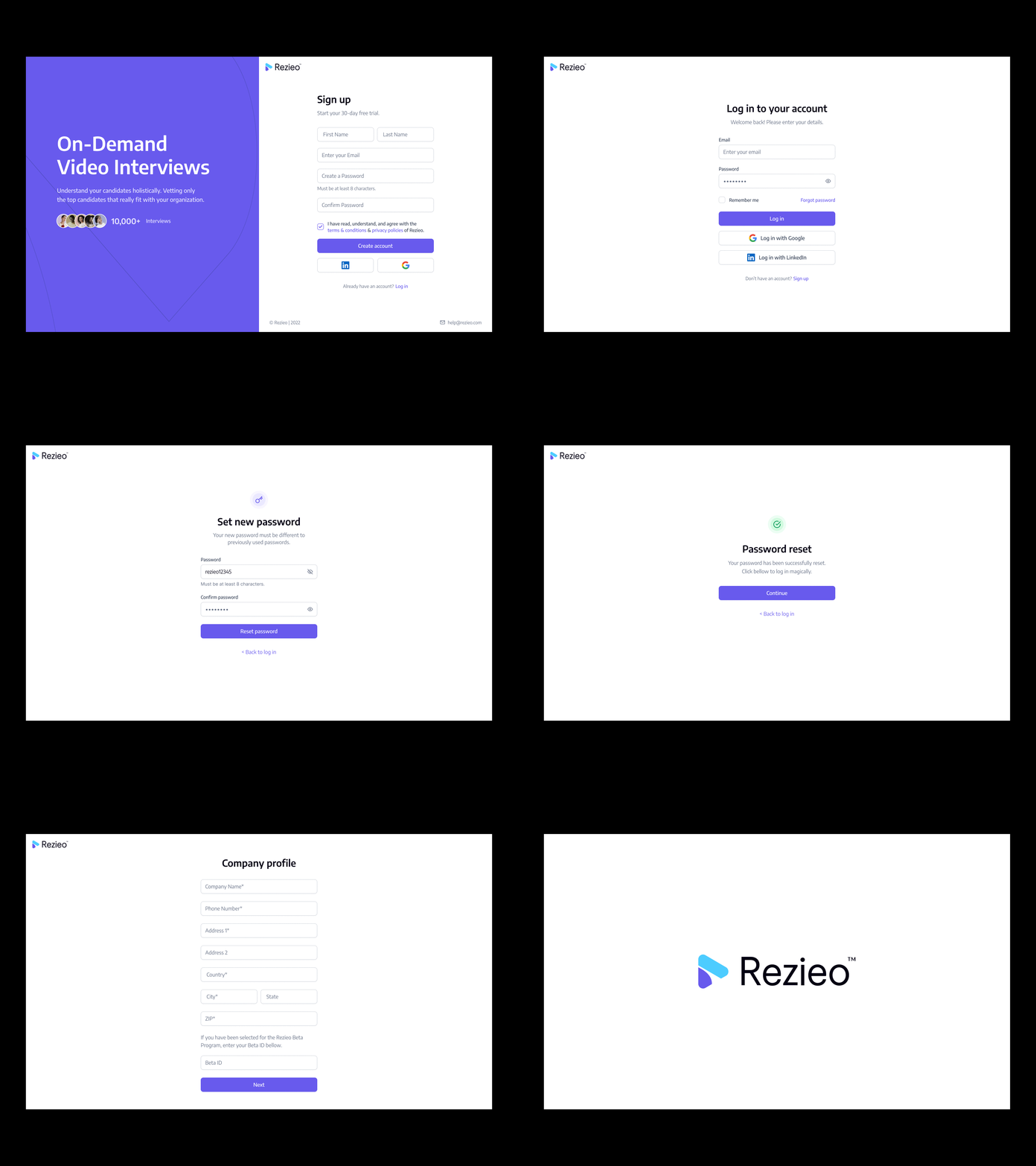
Describing the functionality of the app in general terms, Rezieo is a web application for On-Demand Video Interviews. The application had a lot of functionalities and steps, therefore, the user interface for this sort of product needs to support the high level of visibility for changes, intuitive navigation, and presentation of big data bulks with a high level of readability and visual marking of key details. The basic objective was to design a platform that will be easy to use, informative, supporting broad functionalities for HR and management professionals.
At the UX design stage I worked over layout and navigation design solutions concerning three issues:
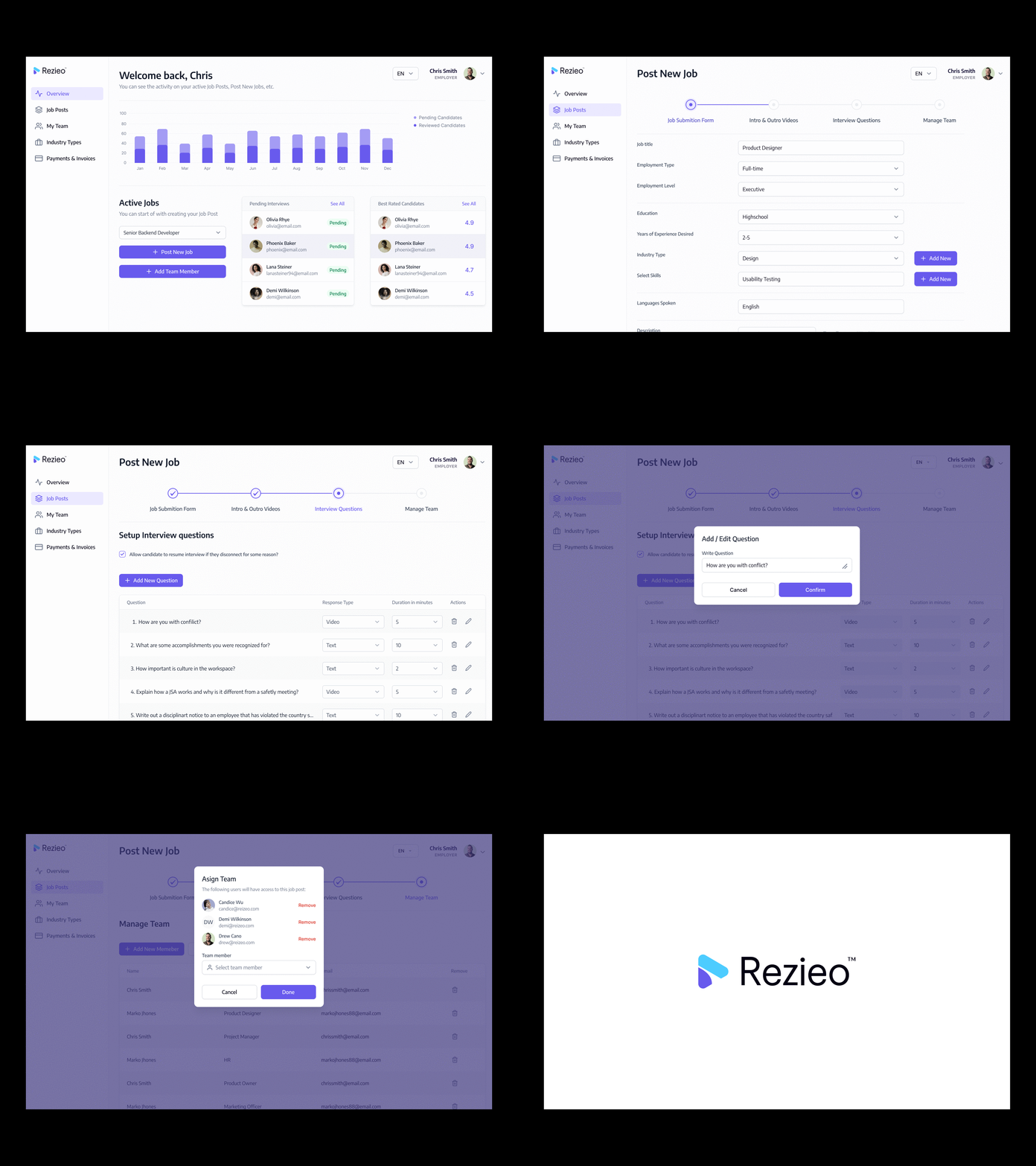
– a way to simplify the "Job Posting" process (as one single step included so many fields and options we had to split the process into 4 steps)
– a way for the person uploading the Job post to see on which steps he is currently on
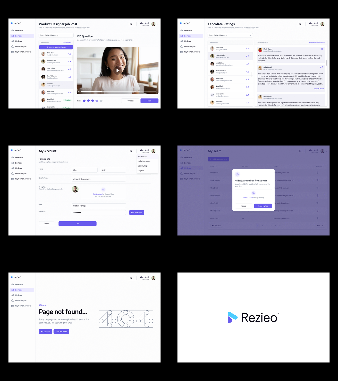
– simplify the "Candidate Interview" process
Obviously, this part of the design process, based on specific knowledge about the field, needed tons of discussions and tight collaboration with the client.
Being a hirer himself, he brought out the idea which was deeply user-centered and problem-solving in terms of application for the hiring process, thus his detailed explanations of the operations were helpful for setting convenient and efficient layout, transitions, and navigation of the interface at UX wireframing stage. A thorough analysis of the target audience and the unique selling points of the product allowed paying attention to the practical aspects of the product’s functionality.
As the application was quite large with so many font sizes, colours & interactive elements we created a Design System with reusable components in Figma.


