NovoFX — Logomark 03©

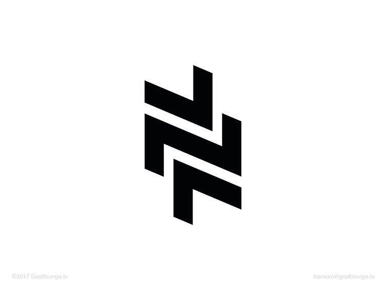

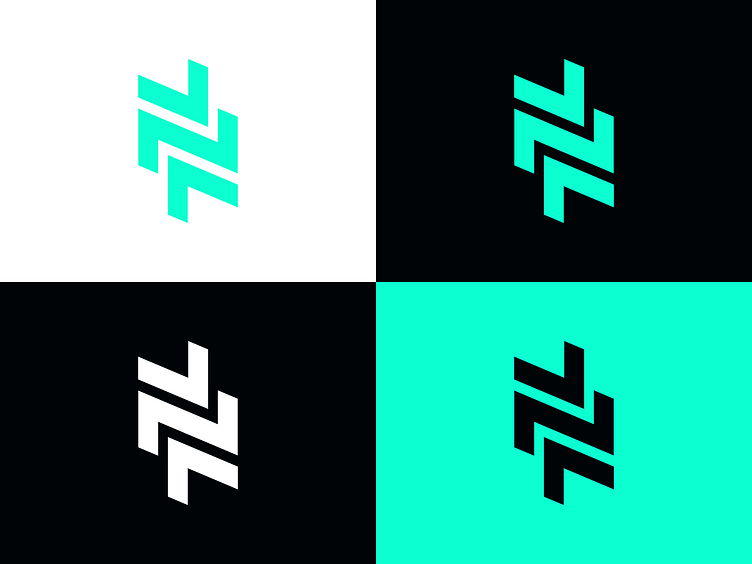
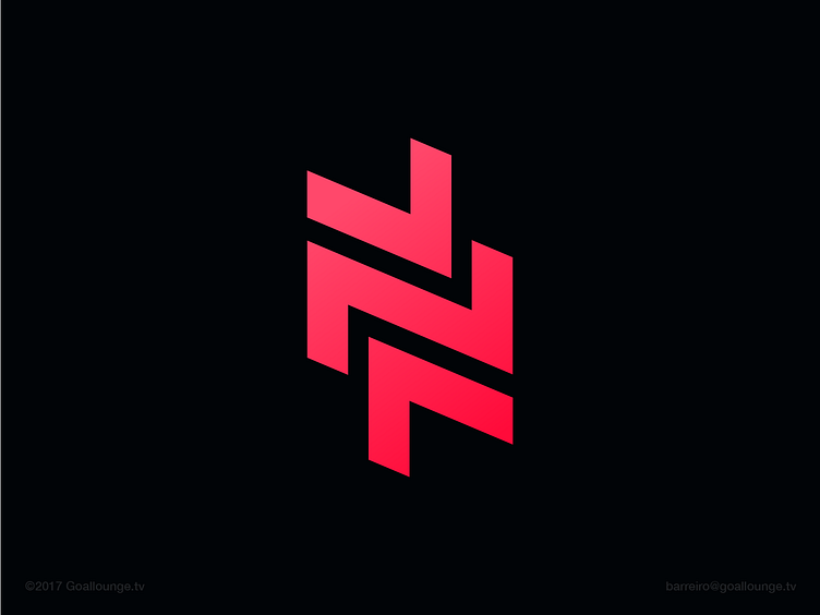
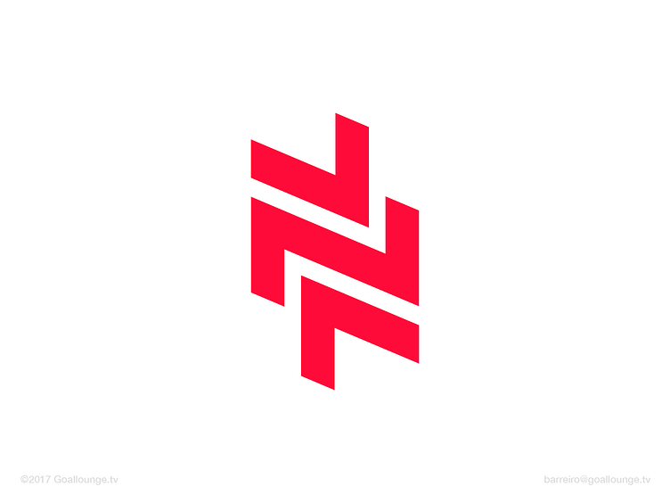
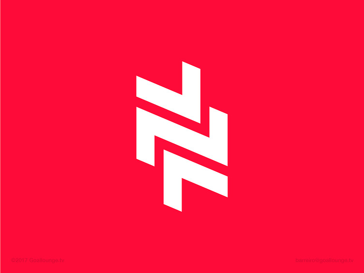
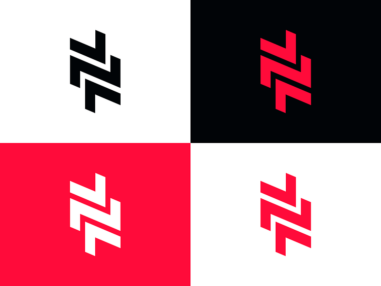
The third iteration of a logomark created for a remittance app called NovoFX. Like logomark 1, I focused on the letter N and arrows as the key symbols that convey the narrative of movement and the transferring. Which colours do you prefer? The green or the red?
Client: ABSA Group
--
