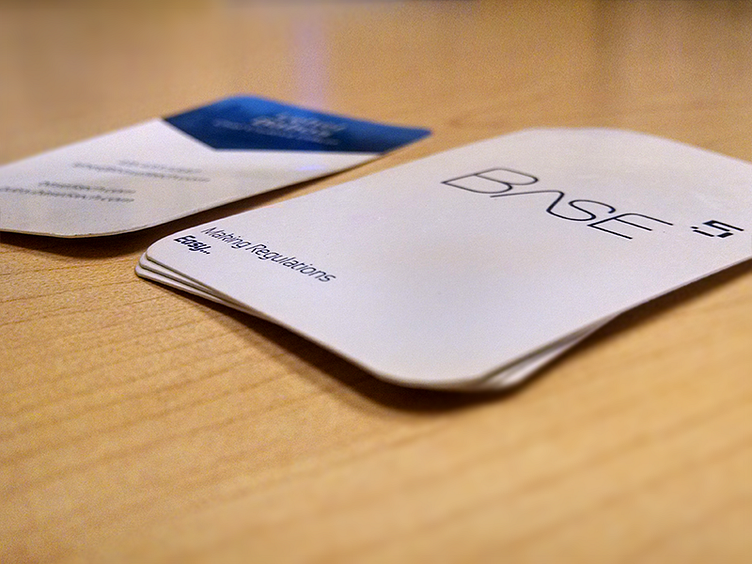
Base5 Business Cards
Part of a larger project, this is an "in the field" shot of the business cards I did for my start up. The cards themselves were done in Illustrator (more detailed shots of the actual design coming soon). We tried to make the cards stand out a bit without breaking the bank, and the team was really happy with how they came out (hurray!)... Though I'd definitely like to change some things for v2.
Some of the details:
- Rounded corners (I really wanted these. 1) they just look cool and 2) I find the hard corners on cards are usually the first thing to get bent - Matt back with lots of white space in case we want to write on the card - Spot UV on the logo to help make it stand out. This also gives it a sort of embossed effect that is actually really nice to the touch.
