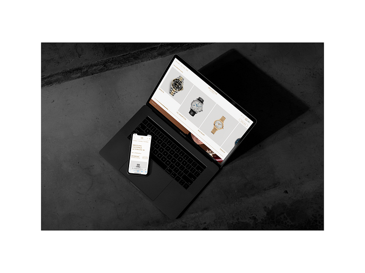
Hodinarstvi Bechyne – new website
The new Hodinářství Bechyně premium website builds on the new visual identity from last year and presents this traditional brand in a new light and in the online environment. Greater emphasis on the stories within the magazine, rich product galleries, small interactions, simplified navigation and overall space for typography and clarity should evoke the atmosphere of a personal visit to HB boutiques before you decide to go to it, whether you are looking for Rolex or something smaller.
Designed with @jonatan_kuna
Behance case project:
https://www.behance.net/gallery/142140317/Hodinarstvi-Bechyne-premium-website-for-watch-seller
2022
Client: Hodinářství Bechyně
Designer: Michael Dolejš, Jonatan Kuna
Cooperation: OptimWeb (web development)
Font: Domaine
Type: Web
