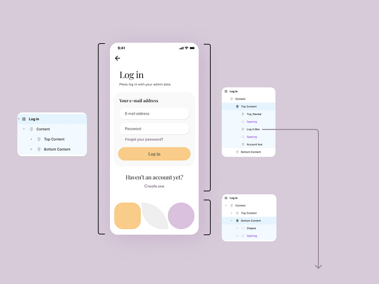
Layer naming - Screen anatomy 1/3
Layer naming
One of the biggest challenges in projects is the general rule of naming the layers. Adding a proper name for each layer improves readability for developers and other designers working with this project (especially future ones).
We always create the top layer as Content and (often) split the screen into two sections:
Top Content
Bottom Content
Cmd + y or (Shift + o) on Figma
The Outilene view is our favorite! We can see all the hidden and visible elements. Thanks to this view we can see the whole structure of the designed screen (screen anatomy).
We are still exploring new solutions and iterating them. The design process never ends! 🔍
Our main goal is to make the collaboration with developers as smooth as possible.
Screen anatomy contains:
layer naming
auto layout 💛
spacing
More by intent | IoT Agency View profile
Like


