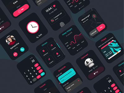
Smart Watch UI
Hello, Creatives!
As you know, digital life is developing at a breakneck speed and is more accessible than ever, which would bring about new design challenges that excite me. Anyway, this is my exploration of the Smart Watch interface design showing key features that allow you to track and complete your daily activities.
In a nutshell, you should consider the following notes in smartwatch UI design: Avoid displaying too much information, emphasize important information, create visual groupings, rely on gestures, save screens from UI elements, and finally, consider the size of the user touch point.
Let me know what you think about the design.
And! Don't forget to press the "L" button!
________________________________________________________
Need help with your design? Drop an email to design@duxica.com.
Never miss a post. Follow us on Dribbble.
We are a Canadian UX and UI design agency that helps startups and growing companies turn ideas into exceptional digital experiences.


