Candy Technology Short Branding Design
Candy Short Brand Identity
Hey cool people! I'm here once again with a new short brand identity design for a fictional domain and hosting service company. 🙂
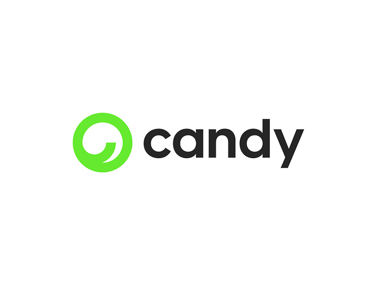
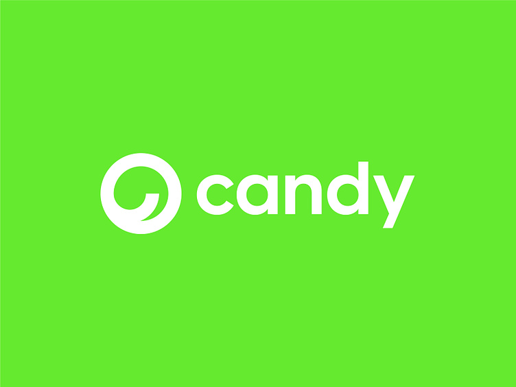
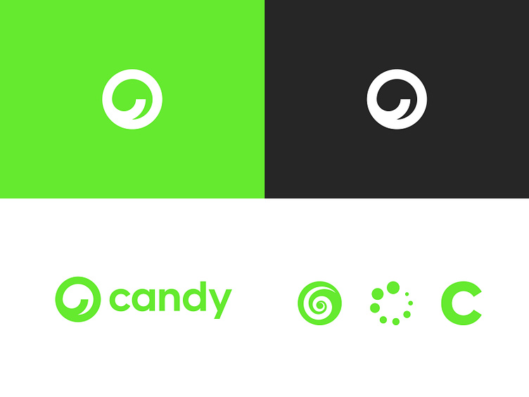
The icon of the logo symbolizes a candy, a loading symbol and the letter c. The reason for naming it candy is to make it humorous. And also candy looks like the loading symbol.
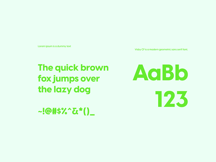
Then the typography is used to make it look modern. To be that done, I used a sans-serif font.
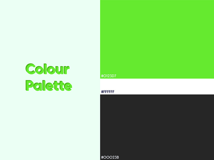
The colour green represents freshness, goodness and security also. So, I think green is nicely usable here.
For business inquiries,
Mail: hello@inbrandit.com
WhatsApp: +8801963851346
Other links: https://zaap.bio/inbrandit