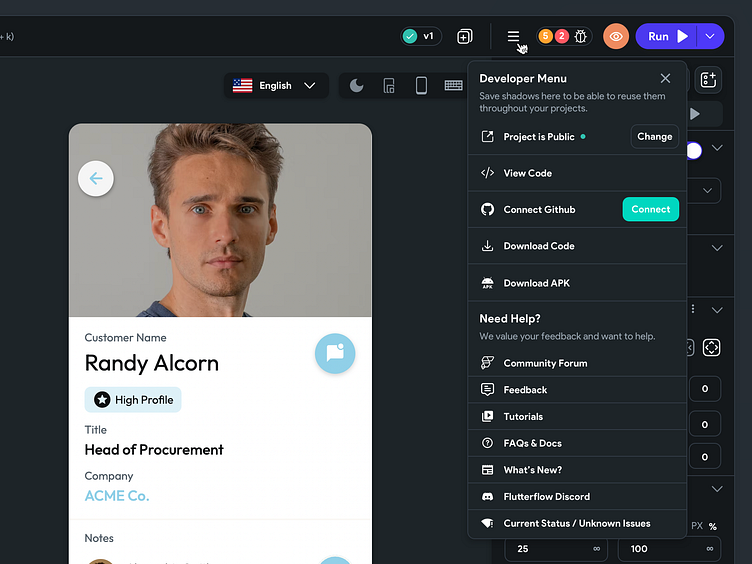
Mega Menu in Flutterflow (WIP)
Exploration
During our last few development cycles we have added quite bit of features and capabilities in Flutterflow, with those updates our top nav has again become cluttered and I was wondering how beneficial this dropdown could be that combines 4 icons into 1 while taking away no functionality at all.
Providing for different Use Cases
We have to think about a few different use cases when designing this menu, we have to think about the default view, free plan view, public project view and when the project is yours but it is publicly shareable. I have worked through a few of the use cases below.
All of these screens (the screenshots in the design) were built in Flutterflow as well.
Enter your text herCheck out these features here: Start Building
Follow us on Twitter, flutterflow.io
More by Andrew Daniels View profile
Like

