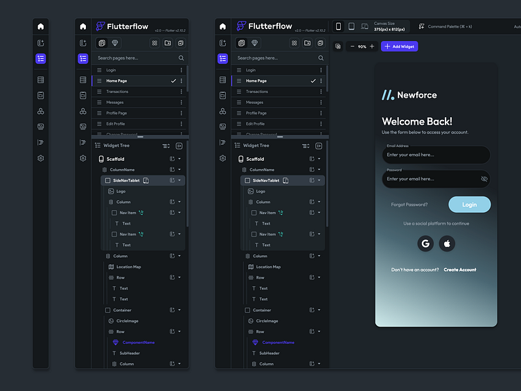
Updated Nav & Icons
We are constantly fine-tuning the UI and UX of Flutterflow so that we can help our users build quick and efficiently like they have never been able to before.
One of the larger improvements in my mind has been this split view for pages and widget tree (or layers for designers) we have also rolled out a command palette v0 for easy navigation and a detached builder panel where you can drag widgets onto the canvas easily while still keeping your pages, widget tree visible.
Check out these features here: Start Building
Follow us on Twitter, flutterflow.io
More by Andrew Daniels View profile
Like

