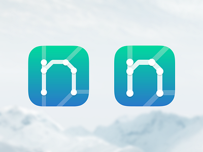
Nextr 2.0 App Icon
Added a gradient and cleaned things up a little. So it's down to 2 versions. Either thin with an additional line in the left corner or bold without that line. Thoughts?
More by Bureau Oberhaeuser View profile
Like
