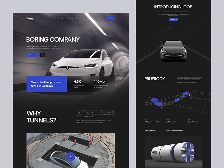
Boring Company Landing Page Concept
The company's landing page should provide all the necessary information on the product and still ignite a spark of interest.
This concept represents a tunnel building company. This working field is not very exciting. However, the web design still captivates the viewer. It consists of black and gray colors that correspond to the theme of metal and concrete constructions. A pinch of bright blue hints at important info and softens the dark theme.
Let's collaborate!
hi@conceptzilla.com
Discover more about us at conceptzilla.com
More by Conceptzilla View profile
Services by Conceptzilla
Like
