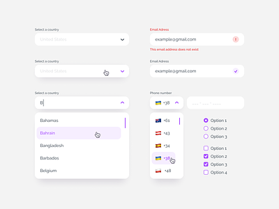
Form elements
Forms are everywhere and they serve various purposes — e.g. sign-up, subscription, purchases, etc. Although they are quite widespread, users are often unwilling to fill them out. Why so? Because they have poor design; they are not intuitive, not engaging, and not clear.
Here’s a collection of some of the most used form elements — a text field, dropdown, a checkbox — and how you can implement them in the interface design.
If you enjoy CXDojo designs, save them and give us a like ❤️
More by CXDojo View profile
Like
